Using Gemini to Rethink a Dashboard
2026-04-08 11:39 AM
#I've got a small app I use to keep track of student progress toward learning goals. I break my chemistry class down into simple "I can" statements for each unit and give feedback on students' abilities on performing those skills. They range from lab skills like "I can prepare a solution at a given concentration" to conceptual material like "I can explain why water's properties allow it to dissolve different substances." This gives students specific goals for making improvements and allows me to actually observe and give feedback on meaningful skills in chemistry.
Since originally building it, I've added little things here and there which help me visualize proficiencies across the year between classes. I'm happy with the overall structure and I can get the information I need, but dang...I can't make a smooth interface. There are some small friction points that I put up with, but I always feel like there's a tweak I could make to help, but I don't know how to turn that feeling into action.
My current dashboard is extremely spartan. I have a card for each standard with a couple action buttons followed by a long list of assignments. The feedback happens in a grid of forms for each student that I can either individually or bulk fill with feedback, but submissions happen individually. I want to make each course page more informative and clean up the feedback process to be more efficient.
I decided to give Gemini the following prompt to see what it could come up with:
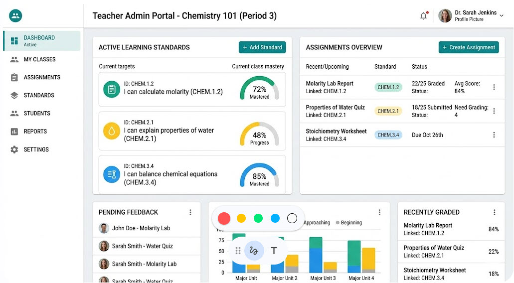
Design a web application dashboard used to give students feedback on work. The admin page for a teacher should show the current active learning standards and the assignments linked to that class. Standards are statements like, "I can calculate molarity" or "I can explain properties of water."
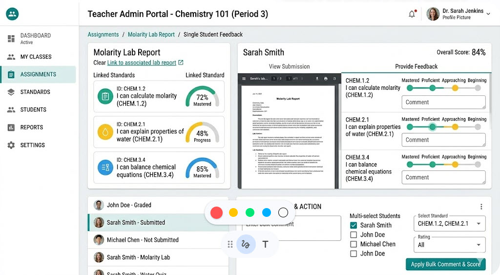
I prompted again for the feedback portion with,
Create a second dashboard mockup showing how feedback could be entered for standards on a single assignment. An assignment page for a teacher should allow for feedback on multiple linked standards. It should also allow the teacher to add either individual feedback or bulk comments on student submissions.
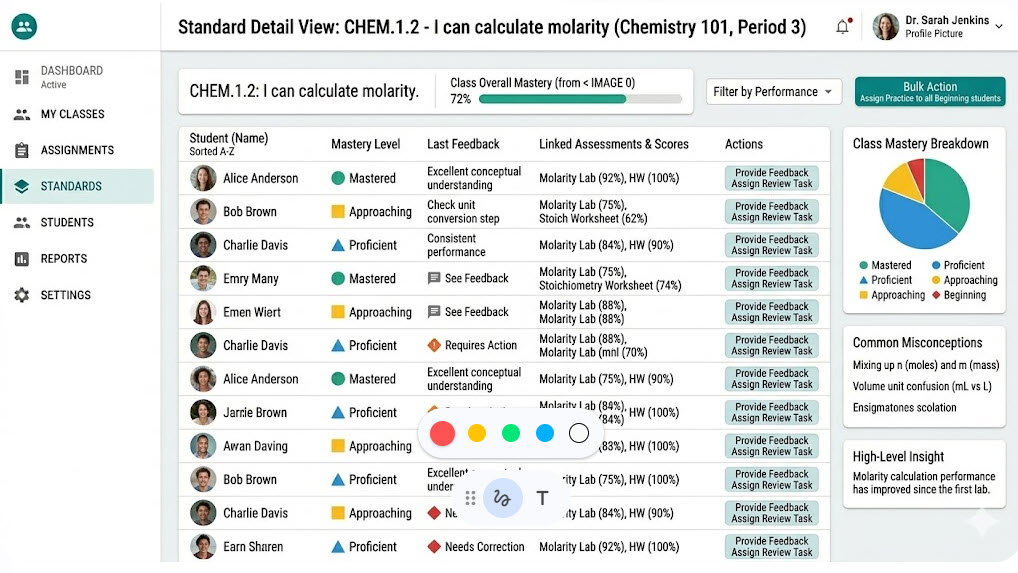
And finally a third prompt for showing aggregate data for a skill in a course:
Create a screen showing specific details for a given standard. It should include students in the course and an overview of their feedback on that standard. It should be easy to browse and provide insight to their performance compared with the class overall.
Now, this is very Material Design because it's Google and dashboards are all the rage in material design land, but I'm looking beyond the aesthetic. This little exercise gave me some tangible ideas about how to do some of the improvement work on my own this summer. I think this is one of the first tangible uses I've personally had with LLMs, which is something I'm going to have to think about. I'm not planning on having it generate any code for me, but I think it will help me iterate on what I find helpful and what I could do without.
Previous
March 2026 Reading