Every Friday, our local NPR station has a segment called Michiana Chronicles which features essays by area writers. I don’t catch it often, but I happened to be driving today when it came on. It’s titled Mug Storiesand it inspired this post.
I definitely have my own preferred mugs. I usually look for the wide-mouthed blue mug that we got in the Korean equivalent of a dollar store. I bought it because I needed something for coffee in my first teaching position. We were 24, transplanted to the center of Seoul and learning how to build a life together. That was the same year I bought my wife the wide, hand-thrown mug with a violet painted on it from 인사동.
Our overseas mugs aren’t limited to Korean origin. We also have a nice heavy vessel from Austria adorned with Schladminger that my wife obtained while studying overseas during college. We’ve both been to Austria, though separately. I’d be okay going back some day with her.
(This photo is from Bavaria in Germany, but Austria is just past those mountains, so I’m going to count it.)
We had a smaller mug from Thailand from our trip during Christmas in 2010. It was brown with a white glaze ring around the top and a mosaic-like pattern on the white. It was delicate and made the 7,000 mile trip home fine only to have the handle broken in our dishwasher one afternoon.
Some of our mugs come out more frequently in particular seasons. We were gifted two mugs from a local potter as wedding gifts. We got to go to meet Peter the Potter in his workshop and pick out two hand-thrown pieces. One still survives today, nearly 10 years later (the other developed a hairline crack and it started leaking). We were married in the spring but the burnt orange and earth colors of the glaze make me reach for it more in the fall as we hunker down for the cold winters.
Other mugs don’t come out enough. It’s a reminder that we need to have people in the house…enough to use the mugs that don’t get used regularly. They’re just as good as others, but for one reason or another, they’re relegated to guests only. We ended up hosting Easter dinner this year. Family and friends came over for a meal and all of our mugs were in the dishwasher that night.
Adding to the list of things to blog so I don’t forget about them in the future, I built an event manager web app for prom.
Sales
Writing data to/from a spreadsheet through a webapp is faster and easier on the sales team than having them edit a spreadsheet directly. Names are pulled by matching ID numbers in a lookup database and populated in the form automatically.
When a ticket is sold, the name is added to a running list on the right side. The app also ensures no students purchase tickets more than once by comparing current sales with the submitted ID number and returns an error if the person already exists in the sales record.
Manager
Students are checked into and out of the event by the door staff. A full list is returned to the app that can then be filtered by ID number by the staff. Clicking on a number populates a card showing the student information for verification. They can then be timestamped into and out of the event by the staff.
This worked well because each of our students has a unique six-digit ID number we can use to look up their information. It could be quickly repurposed to assign an ID number at registration rather than assign a name and have the manager page function the same.
In December, I moved off of WordPress to Jekyll. This is easy to do with GitHub Pages, but I wanted to self-host because keeping a SSL certificate was important to me. I followed Tim Owen’s sample had everything up and working well.
I faced two specific challenges, though.
FTP and SSH uploads were blocked in several places where I normally work. That meant I needed to remember which files needed to be uploaded via cPanel every time I wanted to publish a post. I would often forget an image or have a broken link, which meant regenerating the entire site.
Because SSH was blocked, I had to use a cron job to publish the post. I would set one up to run every 5 minutes while I was working to make sure the changes were correct. Then, I would delete the cron job.
The bigger issue was that building on the server duplicated the site files. So, I’d have a folder of all of my posts and assets (images, styles, etc) that would get copied into the live site. Instead of shrinking my server footprint, it was doubled. No good.
My next idea was to use git, which is preinstalled on Reclaim shared hosting (which is awesome), to manage all of my files. But, I ran into the SSH problem again (HTTPS doesn’t work out of the box with git and setting it up is a headache). I also had problems tying the folder to the Reclaim location for some reason. So, that idea was out.
I continued to think about the problem and I finally landed on it: I wanted to keep all of my files on Reclaim when I really only needed the _site directory. I can build it on my computer and then publish only the live components.
This introduced another problem: it’s more complicated than just uploading the new post. The _site directory is changed and paginated with each build, so all of the relative links have the potential to change. How would I limit my upload to the site directory without needed to build on the server?
It turns out that you can pull single directories from a GitHub repo online. The key is only checking out the directory you want. Instead of using git pull to fetch and merge everything, you break it down into several steps.
Set up an empty repository using git init.
Assign a remote repo via url using git remote add. So, mine is called nodes-site and maps to https://github.com/bennettscience/nodes.git.
Fetch the entire project with git fetch nodes-site. This finds and maps the entire project to git but doesn’t actually add any files yet.
Check out a single folder with git checkout nodes-site/master-- _site. This creates a read-only directory!
I don’t need to write any files on the server…I do all of that on the computer. This step just grabs what’s been published to the Github repo and displays it as a live page on blog.ohheybrian.com.
Here’s my new process:
Write and build the site on the computer. It runs faster, no need for the Internet.
Use git to track all of the changes and push it up to GitHub. All of the files are public already through the blog, so I don’t care that it’s available publicly there, too. In fact, it serves as a nice backup in case I really bork something up.
Write the steps above as a cron job to pull the _site directory in a couple times per day. If nothing changes, no new files are copied over. If there’s been a new post, that’s reflected in Git and the entire directory restructures with the changes.
My original folder (with everything) came in around 300MB. The new folder, with only the published material, is about 180MB. So, I saved 50% of my disk space by publishing only the live pages.
My coworker, Kat, needed to set up meetings with our 13 elementary schools. Appointment slots would have been a lot of clicking back and forth on calendar events plus her dates were variable and subject to change. She set up a spreadsheet with each school on a row. The challenge was to set up data validation rules that would automatically update after a school made a selection.
cracks knuckles
The first thing to do was to list out all the possible dates. Updating a spreadsheet is easier than changing a validation object in Apps Script. I can also loop the sheet and make structural adjustments on the fly.
Once that list was done, we wrote a function to set validation on the sheet using the date.
Now that validation is set, we needed to listen for changes to the spreadsheet. The onOpen function has an event object which holds information about where and how the sheet was edited. This let us limit the function to changes in columns two or three only. If a cell was edited (ie the validation dropdown was changed by the user) the function gathers event data and passes it along to the workhorse.
Now we can update the validation range. Loop through the entire range of dates backwards. Once a matching row is found, delete the row. Looping backwards prevents your index from changing. We also remove validation from the edited cell at this point so it doesn’t show an error for having a value outside the validation list.
Because validation is pulled from a range, deleting the row (and the value) removes it as an option in all of the other cells! Once the sheet is finished and everyone has a date, you could even add a short loop to push dates to your Google calendar as all day events.
Here’s the full script if you want to add it to your sheet.
Comments
Ali
Very nice article, I’ve really enjoyed reading it. Dear, is it possible to set validation rules in Google forms for short text question type by mathematical logical equation e.g. Input should satisfy input % 2 ==0
No, you can’t use logic operations in form validation. The closest would be to use a regular expression (which you can do) to check for a valid input. If you want logic expressions, you’d have to either validate on the sheet and conditional format or host a web app form that saves data to a Google Sheet. Martin Hawksey has a blog post on a simple implementation.
Ali
Thanks sir for your prompt reply, I do agree with you that validation using regular expressions (regex) provide great way to do several rules that would be otherwise nearly impossible using the other available predefined rules. Despite that the given example above (input % 2 == 0) can be easily validated using regex, someone may sometimes need to validate using some logic by formulas similar to what can be done easily in Google sheets. Also using Google apps scripts (GAS) wouldn’t help as validation script methods provided by Google for forms makes also impossible to deviate from the above preset rules. I really appreciate your help for providing your suggested post, and if available please provide other basic sources of information for work-around tricks.
Mehul Gandhi
Hello Can you help me out for the below case?
I am working on one google sheet, where I have applied data validation on date (i.e. user (i.e. to whom I have shared the file) can enter / select only today’s / current date for data entry.)
Now the case is, sometime due to some reason, user was not able to do entry on same day, so I (i.e. Owner / admin of file) can violate that data validation criteria and can enter / select previous date.
When you set the validation, there are options in the object to either reject the change or to show a warning. In the script linked, change line 8 of
setValidation.gs
to:
let validation = SpreadsheetApp.newDataValidation().requireValueInRange(rules).setAllowInvalid(true).build();
Setting
setAllowInvalid
to true allows an invalid input, false disallows the input. As far as I know, there is no way to allow a single user to follow one rule and another use follow others. You could achieve the same without using data validation by checking the onEdit object trigger and seeing who made the change before accepting/rejecting the edit.
Nests
how to fetch data validation in different spreadsheet
This is another entry into the “fun, but probably not feasible” folder.
A colleague and I have been trying to show the importance of getting a knowledgebase set up for our teachers. It’s been a back-burner issue for a long time because:
we’ve never had one, so there isn’t really a pain point, and,
we’re trying to roll out 3,500 iPads to 9-12th grades and there are some small projects to get done with that process.
There’s a little bit of hyperbole there, but in essence, it would be nice, but not now.
Google released Hangouts Chat for GSuite users. The main reason was to compete with enterprise chat apps like Slack (but you won’t hear Google saying that directly). Hangouts Chat allows you to set up discussions with teams that are threaded based on rooms. They’ve also added an automation API so users can find, or write, bots to discussions. I got Chat turned on for our domain just to see what it was like. I was able to use Google’s code lab guide to get a simple bot up and running. It pulled open tasks for a user from our project management suite and I was able to use existing code to get the data into the bot. In all, it took me about two hours to have a working prototype.
I decided to build a helpdesk chat bot which could pull answers to common technical problems our teachers face. That ballooned into a web app to pair with the bot because…why not.
Apps Script Knowledgebase
I’ll go through some of the code, but all of it is on GitHub. It’s written in Apps Script because again, a lot of the code was preexisting so I didn’t have to start from scratch. Most of it is modified from standalone functions I have running in separate functions on other sheets. The real challenge in this task was to wrangle the user input into something usable by the script.
The database
First things first - we needed a database. I threw together a spreadsheet with several data fields that hold different types of information. I started with our platforms as a high level filter and then added some tags. The user can search for all platform-related entries or narrow them down with keyword tags.
click for a larger view
There are two additional sheets to the template: one to authenticate users and one to build a list of district platforms. Authenticated users have a button to add new articles into the database from the web app (see below). Editing a really big spreadsheet, especially when typing multi-line, HTML formatted entries, gets really cumbersome, so I wanted a way to do that through the website. Additionally, standardizing the platform options helps the user narrow searches right from the start so they can find information quickly.
The bot
Setting up the bot is covered by Google’s Code Lab, so I’m not going into detail here. The main piece of the bot is that it listens for a mention by a user, finds the information, and returns a card-formatted response.
Our thinking for this app is that someone wants a quick video on how to do something, so only videos are returned. The main challenge is getting meaningful information from the user mention in order to match database entries.
The regular expression looks for any of the keywords mentioned by the user in a string. This was easier than trying to match array values and provides consistent results. Right now, a user can send simple requests like “Google” or “Canvas” to get general results. They can also include some refining search terms, like “Google gmail” or “Canvas assignment” to narrow searches down. If there are no videos that match the search, they’re pushed over to the web app which has articles that do not include video results. More work could be done to refine how the script processes user input to improve the experience.
The script takes the string an creates a regular expression which is then used to match a string built from columns one and two of the spreadsheet. If a result is matched, the YouTube URL is returned in an array.
Once the YouTube videos are grabbed from the sheet, they’re broken into video ID strings and put through the YouTube API to get the video title and thumbnail. The bot builds a card to return to the user with suggested videos. If there aren’t any videos available, the user is given a link to the web app where they can find written articles on their topic.
The web app
We also threw together a web app to display information that isn’t in video form. The idea being that these are longer articles that have step-by-step instructions and are meant to be used in conjunction with the chat application. Lookup can be done by either passing query parameters in the URL to the app or using the sidebar form to search for keywords within a given topic.
click for a larger view
Web apps also allow you to append queries to the published URL out of the box. If a query string is included, the app creates an object that can be passed through your script functions to build a display from a template dynamically. For instance, navigating to
When a video isn’t returned, we’ll pass back the user string to jump right to relevant answers.
Challenges
Writing logic to manipulate and understand user input that can vary wildly is very difficult. I’m relying on simple prompts (platform + search keys) to help return a video on every search. As the database grows, results will also improve. I’d like to spend more time refining the bot script to better process and use the chat messages. The regular expression approach is pretty brute-strength, but it works for most searches.
A bigger problem I discovered is that hosting a web app and a bot in the same script file causes things to break. Google makes it easy to deploy a bot from an Apps Script project. Hosting a web app is also quite easy and uses a similar ID string. What I think happens is that those ID numbers are conflicted when both are hosted from the same project. The bot’s onMessage listener wouldn’t register an event with a web app published. One solution is to host the bot in an unbound script that points to the same spreadsheet via the key. Another (probably better, in the long run) solution would be to write a web view that is hosted on a school server and access the Google Apps Script API to display database queries. More on that in this long demo.
Now it’s down to the What of your unit. Standards have been identified and selected, themes established, and your main mechanism for assessment has been designed to check what students know and can do at the conclusion of the unit.
The center of the Golden Circle isn’t the most important. It’s the component that fits within each of the larger rings. The What of your lessons should drive students toward successful completion of the assessment mechanism which, in turn, shows you what the students have learned of the identified standards.
The What is hard to specify, because the variety of activity in a flipped environment depends on individual student needs. Using the 5E structure helped me plan meaningful and varied activities all within the large scope of the unit.
If you’re not familiar with 5E, here’s a breakdown:
Engage
Explore
Explain
Elaborate
Evaluate
I bolded Engage and Explain because it’s where I focused much of my effort in early unit planning.
Engage
It’s easy for me to stand up front and teach a topic. I can communicate ideas clearly and succinctly and ask students to demonstrate understanding with a variety of mechanisms. But, that sucks the joy out of learning something new (not that all students will love chemistry, but you get the idea). Ramsey Musallam and Dan Meyer are two really smart people I found early in this transition who helped frame my view of the engage portion.
Ramsey’s Explore-Flip-Apply structure fit well with my goals. Science is the practice of observation and I wasn’t great at getting students to observe phenomena. Use EFA at times, I was able to both engage the students in an interesting question and push them to draw conclusions based on lab experience.
Dan has pioneered 3 Act Math approach, which works to drive student inquisitiveness as a carrier for math instruction. I took his advice about practicing capturing perplexing things and started trying to photograph or film things that would be useful for engaging my students. (The previous link is a video about halfway through Dan’s 2014 CUE keynote. I recommend watching the entire presentation if you can find the time.)
This is hard to do, mainly because what I find engaging might not be engaging to students at all. Expect to swing for the fences and miss with some. As you hone your units, your engage activities will improve.
Explain
After exploring an idea, there will inevitably be misconceptions which need to be corrected. This is the Flip in Ramsey’s Explore-Flip-Apply. I can assess and gather information about student understanding as they explore and then I can use the power of a camera and a short video to instruct where students need the intervention.
If you’ve been flipping for a while, you know where students struggle. You probably already have a library of support videos you can filter into the unit. This also helps you identify gaps in your own instruction! Pay attention to what material students need additional help with and continue to build those resources out. Structuring your unit (not just a lesson) this way will also help you target which lessons are the most important, and that’s what students do. You don’t have to assign everything every year because the goals of the unit stay the same while student understanding changes year to year or class to class.
More on 5E
Each step in the 5E structure were not prepared for every single day of every single unit. Some components were easier to run across several days (or even weeks) because of low overhead (no prep, etc). Others were limited to specific dates and times. This is particularly important in a science classroom because of lab availability and safety considerations. Giving students choice in how they tackle a particular activity does not mean carte blanche. Specific constructs and limitations are acceptable.
Without repeating the linked 5E article above, Elaboration focuses on connecting to other ideas rather than staying within the immediate context. This is a great place to spiral back to previous units or to build anticipation for future units. It forces you to continue to consider the connections at the standards level rather than looking 24 hours in the future. Not only are your units more powerful, but your course as a whole takes on a larger internal support structure.
Final Thoughts
Much of this is written from secondary math/science perspective because that’s my experience. If you’re not in the same context, pay attention to the support structures rather than the individual examples. How are your standards mapped out? Have you mapped them out? Start large and work down to the day to day. This ensures students have a consistent experience and that the unit has internal fidelity to specific ideas. Looking day to day narrows the scope and makes it too easy to dictate the entire path of the course.
This is a skill that develops over time. There are strong communities of teachers on the FLN website and Slack channel. Get connected with others to solicit feedback and suggestions from people working on the same ideas. As you continue to zoom your lens out and work down to individual lessons your skill will build and your students will benefit.
Thanks for reading the series. If you have questions, leave a comment or head over to my website and drop me a line.
Several articles swirled around early this week about Salon.com’s (sorry, not going to link it) new ad-blocking choice to users. You can:
Disable your ad blocker to see the content, including ads.
Keep your ad blocker on, but allow Salon to mine bitcoin with “spare processing power”
This is a terrible, terrible system for several reasons.
Bitcoin isn’t mined with “spare processing power,” as the FAQ claims. It’s mined with electricity, that you pay for, for no reason at all. I’m not going to go into super detail because this post, written on a related topic, has a great explainer on how Bitcoin “mining” actually works (jump to “Why this is bad” in the post).
Also included in the FAQ, “nothing is installed” on the user’s computer if they choose to opt in to mining. This also isn’t true. It’s true in the sense that I don’t have to download and install a program in the traditional sense. But, if I opt in, Salon installs a script silently through the browser which begins to work in the background with no notice to the user.
Also this week (coincidentally), there was a malicious mining script placed on thousands of government websites. When a user loaded a page, the mining script went to work at the expense of the user’s computer. As cryptocurrencies continue to bubble, I think we’ll be seeing more and more of these “opportunities” at the expense of the user.
The problem with ads isn’t the fact that I’m seeing ads. The problem is that ad technology on the web is invasive, expansive, opaque, and a really terrible experience for most users. Ad software builds a profile of an individual to target more “relevant” ads based on your browsing history. If a company tracks you on a particular page, that page’s content is stored and called up next time you hit a page with that company’s software.
These algorithms are totally opaque - no one knows exactly how they work, which means you - the user - are a product, not the consumer. As a consumer, sure, I want to see relevant ads. But that data which is used to show me advertisements is also sold by clearinghouses to other companies for profit. I’m a transactional item, not a customer. The nature of advertising on the Internet has fundamentally changed.
Salon’s adoption and PR to convince people that this is a fair exchange is misleading and doesn’t do anything to address the fact that Salon-the-organization is getting money from companies with shady, at best, business practices. Selling readers while claiming they’re selling ad space takes advantage of illiteracy in how the Internet works. Masking this practice is underhanded and should be recognized.
Once you know why you’re teaching what you’re teaching, you need to define how you’ll know what students have learned or not learned. What task(s) will students complete in order to show what they’ve learned as you move through the unit? Keep in mind that this does not necessarily have to be a written test! This step in planning helps you meaningfully outline the Why of your unit.
Default Action
Defaults surround us. When I use my computer, I have a default web browser. I have default settings on my phone. When I get home in the evenings, I change into more comfortable clothes. Defaults help us work effectively and efficiently to accomplish a specific task.
We also have defaults in our teaching. When I need to quickly assess students, my default is usually a quick poll (choose the best answer from the board) or some targeted questioning to reiterate some important points from the activity. Those quick checks are routine for my students and the default action helps me effectively check for understanding without significant interruption of the class flow.
Defaults can also be dangerous. If I’m going out in the evening, my default clothing choice would not be appropriate. Asking students to answer a single multiple choice question (probably) won’t show me deep understanding. Our default actions need to be overridden from time to time depending on the situation. Relying on the default is particularly dangerous when you’re planning your unit assessment.
Understanding By Designing
This portion of the planning process relies heavily on Understanding By Design (UbD), also called “backward design,” developed by Grant Wiggins and Jay McTigh. UbD outlines seven key principles which permeate all instructional decisions. I’m not going to go in depth on the entire framework in this post, so I encourage you to go read more about how to implement UbD.
At it’s core, UbD “helps focus curriculum and teaching on the development and deepening of student understanding.” The How defines how students demonstrate their learning. I cannot answer the question of whether or not students learned without some kind of assessment mechanism. The Golden Circle parallels the three-step process outlined by UbD:
Desired Results
Evidence
Learning Plan
We’ve already outlined our desired results by defining and organizing standards. Now it’s time to dive into the assessment mechanisms that will flow throughout your unit.
How Will You Know What They Know?
The purpose of defining the assessment before the lessons is to ensure you are hyper-focused on teaching the standards you outlined in the Why. This is absolutely teaching to the test and it’s absolutely okay. Understand that teaching students the material you outlined is expected! Don’t fall into the trap of labelling your instruction as “narrow” or “prescribed” because you define the scope of your instruction. If you find something is missing, you can add it to your unit plan! This is an important component of planning because your assessment, to be reliable, valid, and fair, should reflect the material you set out to teach.
As you learn more about UbD, this portion of your unit planning is for the culminating event, not necessarily day-to-day formative assessments. The formative checks are critical because they help you “correct the ship,” as it were, but those are more aligned to daily tasks, so we’ll plan those in the next step.
There are six facets for understanding defined by Wiggins and McTigh that you should work to include: explanations, interpretation, application, perspective, empathy, and self-knowledge. Your culminating event should be broad enough for students to demonstrate many of these facets and narrow enough to ensure they are showing their learning on the defined standards.
A Sample Culminating Event
You have complete control over the culminating event, so try to avoid your default action and plan a true event, not just an assessment.
In my general chemistry course, we spent a significant amount of time on the properties of atoms. Understanding how these little pieces of matter behave is important in later concepts, like describing bonding or chemical reactions. Luckily, we have the Periodic Table of Elements which describes and organizes these properties. A major component was my emphasis on the fact that the periodic table is relatively new - only in its current form since the early 1900’s after many years of experiments and revisions. I needed my students not only know how to read the periodic table (explain and interpret), but to also relate to it’s development and connect it to the nature of science as a revision-based process.
I can definitely assess their knowledge using a multiple choice and essay test, and those were a component as we went through the unit in the form of quizzes. But, I’m missing the other half of the six facets of understanding - empathy, perspective, and self-knowledge. By using a unit test as my culminating event, I was missing opportunities for metacognition and growth.
In 2006, NSTA published an article by Vicki Volpe which described a Periodic Table of Cereal Boxes. I modified the project and added a reflection my students would do to show their understanding at the end of the unit. By putting students in the driver’s seat, I was able to watch them assimilate all of the principles they’d learned over the course of the unit to create something novel. Beyond the chemistry skills, students felt the frustration of building a meaningful representation, not unlike the early organizers of the periodic table. The process involved research, drafting, and revision - and not just one cycle. The reflection included a strengths/weaknesses analysis of their table and many recognized that it wasn’t perfect, but it worked given the data they had access to.
The Role of How
The culminating event brings into alignment to the entire unit. Every standard was assessed in some way, but not in isolation. All learning is connected and our unit assessments should highlight and expect students to make those connections. Designing your culminating event should unify the learning standards and give students opportunity to show the facets outlined in UbD. As a bonus, these holistic assessment items don’t feel like assessments. The conversation changes from “we have a test over this stuff” to, “use what you know and show me what you can do with it.” It’s a rolling performance event for students with checks along the way to ensure a supportive learning environment. This is particularly evident in a flipped environment where students can go back to review material as needed. The support structure is built right in!
What’s Next?
Once you’ve defined the Why and the How, you have a framework which provides support for the What - the day to day items. We’ll look at that in the next post.
I planned, and ran, a really unsuccessful series of PD for a group of teachers this year. Unfortunately, I wasn’t wise enough to accept the non-success until we’d reached almost a breaking point in the group.
The idea was to focus on instructional methods with, or without, technology. The problem was that it wasn’t what the teachers needed (or wanted) and I was too stubborn to look past my own biases and fix the course.
Instruction makes the difference in schools. Teaching a poor lesson with an iPad in your hand is just as bad as teaching a poor lesson without an iPad. With most tech rollouts, all of the focus is on the technology PD and little time or thought is given to how to build lessons and experiences which seamlessly incorporate the available tech. So, this PD focused on watching one another teach. If the lesson had tech in it, great. Let’s look at what worked and then try to incorporate those principles in our own practice. If it didn’t have tech, still great! What worked? What skills did the teacher show that can be incorporated into our practice?
I didn’t clarify the difference. The PD was labelled (partially my fault, but not completely) as “technology PD.” Week after week, I came in talking about teaching and they expected technology tips and tricks.
Making it worse, I heard indirectly that these workshops were going poorly and that most people dreaded the sessions. I knew they were tough - I was pushing boundaries and comfort zones. What I didn’t know was that people felt confused and frustrated. I had no idea the group felt that way because no one told me - not on feedback surveys each month and not in person when I asked.
We’re so afraid of hurting one another’s feelings about teaching that we don’t talk about what’s really happening. That has to change.
The biggest portion of the circle, the Why, defines everything you do in the unit. Before planning a single activity (or lesson), it is important to take time to outline what the students will be learning within the unit as a whole.
This guiding focus will bring consistency to your individual lessons and empower you to build more meaningful instruction. By outlining the standards, you’ve built a roadmap to help students to go from Point A to Point B in a meaningful - and much more flexible - manner.
If the standards are defined, where does flexibility come from? Here’s a chemistry standard I taught in Indiana:
C.1.5 Describe the characteristics of solids, liquids, and gases and changes in state at the
macroscopic and microscopic levels.
From a lesson-centric point of view, I can certainly work with this guidance. Maybe we do a lesson looking at solids, liquids, and gasses in the lab to compare and contrast properties. Then we could look at a PhET simulation and play with particle diagrams. Students would be introduced to the material and hopefully be able to describe properties on their own.
The problem is that I’m artificially limiting that exposure. I don’t know what questions students will ask leading up to that particular lesson. I’m also not thinking about bigger connections because the point of the lesson is to teach the single idea.
By outlining standards rather than lessons when planning a unit, themes begin to emerge. We can move away from teaching standard C.1.4 before we teach C.1.5. More importantly, it gives students a chance to define their own path in describing a particular piece of content. Having options for interaction rather than prescriptions - all within the scope of the outlined standards - gives students more autonomy and choice, which leads to more engagement.
Creating Outlines
There is no ‘best’ way to outline standards, but I’ve found it helpful to create simple documents for each unit I’m preparing. This focuses my attention and gives me one place to brainstorm ideas. I’m a paper-and-pencil first kind of thinker, so I have physical templates that I’ll scribble on as I work. It may also be helpful to print standards or write them on post it notes so you can quickly rearrange as you think, especially if you’re working with collaborative content teams.
If you’re teaching a single course, you really only need two boxes at this point: Standards and Themes.
Single course:
In collaborative planning sessions, look for common threads and throw anything relevant in. This is the brainstorming phase where ideas have equal vitality and worth. You can go back and refine later. Seeing standards on paper will help you set the big idea for the unit, so start at the highest possible level.
Multiple courses (cross-curriculuar):
You can’t begin to design coherent, innovative units unless you know exactly what you need to teach during that unit.
I find it’s helpful to verbalize a story. Why is one standard included, but not another? How are they tied together? What significance comes from the addition (or deletion) of one standard over another? If you’re unable to answer these questions or tie together a narrative for the unit, continue to work through standards until you have something you can articulate out loud.
Looking for Themes
When your standards are laid out and you can articulate a narrative, it’s easier to see common themes and threads. Try to stay away from restrictive topics like, “the 1920s,” or “cells and organelles” because they frequently limit the scope of thinking about material. What connecting ideas permeate all the standards you want to incorporate into the instruction? Brainstorm ideas. Bounce topics off one another. Keep a journal of interesting ideas to loop into other units or pull back in during a different course or even year.
Let’s take the chemistry standard again:
C.1.5 Describe the characteristics of solids, liquids, and gases and changes in state at the
macroscopic and microscopic levels.
This used to fall into my “Properties of Matter” unit (real original, I know). Instead of tackling this idea from a narrow materials perspective, it is rolled into a design unit. Why do we use particular materials for different applications? What industries rely on (or manipulate) some of these characteristics?
By opening up our line of thinking about how to incorporate a standard, our students can now take different paths to showing their understanding through lenses they define. It’s also important to remember that the unit or investigation you design might not fit every student’s interests. Knowing the endgame - seeing the big picture of the Why, will give you and your students flexibility in exploring different ideas.
What Now?
The meat of your work is getting standards aligned. Rather than dive into day to day activities (where we’re all comfortable), map out a sequence of units or even your entire year. If you’re in a district that has a scope and sequence laid out, use that as a starting point.
Standards-alignment helps you see the big picture
Tell a story with the standards. Think about flow from one idea to another.
Identify potential themes or topics that include - but are not exclusive to - the standards you’ve identified.
Familiarizing yourself with the standards that are taught in each unit will help you open up different avenues for student learning. If you’re struggling to articulate why a particular standard is included, move it! You’re the architect of the course - you have freedom and leeway to design something meaningful for your students
In the next post, we’ll look at the How of unit design. How will we assess and evaluate student learning within the context of the Why?
The idea for this series was sparked when I was helping some people research sample flipped lessons for a curriculum workshop I was facilitating. I was embarrassed while working with this teacher because most of what we found was significantly below standard.
That night, I did some more searching and I leafed through page after page of Google results of substitution-level implementations of flipping. Lessons that came up in the search were roughly:
Video for homework, quiz the next day.
Video for homework, worksheet the next day.
Video for homework, lecture the next day.
What I could not find were resources on designing effective and powerful lessons for flipping, let alone units.
This is a problem.
Planning
In my early years, a unit was simply a sequence of lessons around a central theme. Essential Questions guided my day to day work, but instead of focusing on content standards as a baseline, I relied on thematic relationships. At the time, I thought I was giving myself freedom to explore related ideas no “prescribed in the curriculum.” In reality, I was making more work for myself as I pulled ideas in without a guiding framework. On top of cherry-picking pieces of content within a unit, I was trying to flip everything. That meant making videos and corresponding materials to help my students in their learning. The majority of my work was focused on lesson preparation and the overall unit structure was left to nothing more than the sum of the parts.
Flipped Learning has been around long enough for most people to have heard about it if not researched it for themselves. Sal Khan’s 2011 TED talk is a firestarter for conversation among teachers and administrators looking for methods to jumpstart some innovation. Jon Bergmann and Aaron Sams have published a number of books about flipping at the classroom level as well as for particular subjects. Others like Crystal Kirch, Troy Cockrum, Robert Talbert, and Ramsey Musallam have written books (all linked) about their implementation strategies teachers can model as they begin to explore.
The Gap
There is a significant information gap when it comes to learning about how to successfully implement flipped practices. In a culture of Google results and “power skimming,” most implementations begin - and end - with finding or recording lectures that students watch at home and then “apply” in the classroom.
At it’s worst, the teacher becomes a non-essential mediator of student YouTube binging. At best, the teacher essentially resets the clock on student work, promoting passive listening and devaluing the net positives that can be gained in a classroom setting.
Sherry Turkle explores the advent of using technology to engage today’s “disengaged” students in her book, Reclaiming Conversation. Her point is similar - rich classrooms come with discussion and interaction. Savvy and intentional course design is key in promoting this interaction. Flipped Learning can help you build that culture, but only if you’re prepared with the right instructional tools.
So, our question: When you’re asked to design a lesson, where do you start?
Like many, you may identify your Big Idea and Essential Question for the day (don’t forget to put them on the board!). Then, you’d outline your instruction and some guided practice strategies after which you can assess student understanding of the material.
Lessons are easy. As a teacher, you’ve been crafting lessons since your undergrad years. Over time, they may be refined or updated, but planning is typically spent looking at a calendar, outlining day to day activities.
When you design from the top - starting with the biggest ideas and burrowing down through assessment and lessons - you are rooted in the main ideas. Those themes permeate everything your students do, which leads to more opportunities for exploration and discussions on related topics. You won’t need to think about every contingency to engage students when they lose interest because students will define those topics themselves.
Bubbles
Our worldview informs everything we do in the classroom. “The medium is the message,” the adage goes, and it’s particularly important to remember as you begin to incorporate video (or other media) into your instructional habits. The idea of an asynchronous introductory event is not a common experience for most of our students. How will it communicate a shift in the typical learning cycle?
Our bubbles are strong. Our brains work hard to fit new experiences into existing schemas. When they don’t fit, the schema is broken down and rebuilt. Working in a flipped environment will certainly break your students schemas about learning. If your schema for instruction isn’t being broken and rebuilt as part of the process, your wheels will spin.
The Big Picture
To address the shortcomings of planning effectively for flipped material, we’ll be using a modified version Simon Sinek’s “Golden Circle” to plan out a holistic unit from the top down. If you’re not familiar with the Golden Circle, here’s a diagram:
The Golden Circle is meant to help organizations determine their core mission. In many cases, employees (or teachers and students) can quickly answer What it is they do every day. For example, a Microsoft employee would say they make software. A student would say they’re learning about the Revolutionary War or linear equations.
Most people, however, can’t answer the “Why” nearly as easily. Why does Microsoft make software? Why are linear equations taught in school? Sinek’s argument for the corporate world is that by answering the Why for your clients, you stand out - you become unique and a cohesive and productive culture develops.
Schools are not businesses, but the principles of the Golden Circle can be applied to curriculum development. How do we transfer corporate descriptors to the classroom?
WHY: Standards, essential questions, outcomes.
Defining the Why in your curriculum is step one. It sets the tone for the entire course, defining the end results for students. Knowing which standards, essential questions, and outcomes you have for student at any given point keeps your instruction on focus as you plan. Looking unit by unit helps you tell a story to your students - it provides a cohesive overview of how things relate to one another.
HOW: Assessment(s)/capstone event
Once you know why you’re teaching what you’re teaching, you need to define how you’ll know what students have learned or not learned. Step two in Understanding by Design calls this “Assessment Evidence.” What tasks will students complete in order to show what they’ve learned as you move through the unit? Keep in mind that this does not necessarily have to be a written test!
What: Lessons, day to day
You’ve defined the Why and you know How you’ll be evaluating student growth, now you can start to think about the day to day work. Every single thing you plan for your students should support their growth toward showing what they know (the Why) and How you know they know it.
In our application, we’re going to put the Why at the outside, exchanging it for the What:
This Golden Circle hangs on a wall near my desk. It’s a visual reminder as I work with teachers to build units of instruction. Everything defined in the unit is nested and related: all of the What is measured and related to the defined Why. The idea is to root our planning in practices which focus on teaching standards with authentic and meaningful opportunities for assessment.
Admittedly, the visual analogy isn’t perfect because usually, when a dartboard is involved, you’re shooting for the bullseye. We need to get to the what eventually, but it’s always within the context of what’s around it, the standards and assessments.
Each post in this series will dive deeper into designing units of instruction rather than flipped lessons. Comments, suggestions, and feedback are always appreciated.
Long story short, I moved from self-hosted WordPress to a static HTML site generated by Jekyll.
WordPress does it’s job really well. I think there was some statistic [citation needed] that showed nearly 30% of the Internet runs on WordPress in one form or another. That’s a lot of the Internet.
But, because of ubiquity, there is a significant drawback: WordPress sites are prime targets for malicious code and hacking. A plugin on my site shows how many dozens (and sometimes hundreds!) of login attempts there have been. It’s a battle to make sure security plugins are always up to date. That leads to other issues: incompatibility with plugins.
So, This entire blog - 2018 all the way back to 2010 - is a set of static HTML pages generated by Jekyll on my Reclaim Hosting server. No more logins, no more plugins to check and update. Just nice, clean, lightweight HTML.
It took me several weeks to work out the details for the migration. It wasn’t too bad, but I learned some things along the way that I’d like to share here.
Exporting WordPress
Jekyll uses Markdown and YAML data to generate a website. It’s quite clever how they pulled it all together, actually, to mimic a typical dynamic (database-driven) blog like WordPress. There is a plugin which will export your WordPress blog formatted for Jekyll, including all post metadata like tags, permalinks, and image resources. It gives you a .zip file which you can then extract and use to populate your new Jekyll site.
First, it extracts your entire media library. WordPress automatically generates several files for each image you’ve uploaded for different display situations. My media folder was well over 300 MB because I didn’t take the time to clean the library up. I’d suggest cleaning up any unused image files before the export.
Second, any pages you have on your site (not blog posts) get their own folder. Take time to go through each folder and make sure it’ll fit the Jekyll file structure.
Finally, do a regular WordPress XML export so you have an entire backup of your blog. The Jekyll plugin only converts posts and pages. If you have other resources, you’ll want to save them somewhere before deleting or redirecting your site.
Hosting
The great thing about Jekyll is that it is ready to go with GitHub Pages. If you’re already using GitHub, you can go that route with your username.github.io account with a single commit and push. I have a lot of traffic (humblebrag much?) to blog.ohheybrian.com already and I don’t want to set up a redirect. I’m also already using my GitHub Pages site for my (web apps)[https://dev.ohheybrian.com]. You can map a custom domain to GitHub Pages, but you cannot use HTTPS on that domain, which was a dealbreaker for me.
Each web host is different, so you need to see if yours supports Ruby 2.4 or higher. Lucky for me, Tim Ownes from Reclaim Hosting already had a blog post on setting it up with my Reclaim account. I followed his instructions to the letter and got it working on the second try (I borked some theme and file structures on the first, so I deleted everyting and started over).
SSL is a big deal. If you don’t know what it is, read The Six Step “Happy Path” to SSL by Troy Hunt (or anything else he writes, honestly).
Comments
I don’t get a ton of comments, but with a static HTML site, there isn’t an easy way to include comments. If you’re hosting with Github Pages, Staticman is an awesome and secure way to include comments on your posts. Another option would be to use a third-party tool like Disqus. I didn’t go with Disqus because they’ve had some trouble with clean use of user data in the past.
I decided to create a custom commenting form (based on this post) using Firebase. It’s a real-time database run by Google which can push information anywhere I want it to go. Each post has a query to the database to check for comments. Pushing the comments to the database is handled with a little bit of JavaScript, which I’ve modified from the linked tutorial:
Firebase also includes cloud functions that can be written in Node JS. I’ve never written any applications in Node, so this was a learning experience for me. This function watches the comment database and simply notifies me if a change has been made using the following script:
It could definitely use some refinement, but it does what I need it to do.
Updating
Relying on an Internet connection to write a blog post seems so 2012. With Jekyll, I can write in any text editor and then upload when it’s ready. If I’m on my main machine, I can even serve the page locally to see what the update will look like as if it were live on the web. It’s a small perk, but as I’ve moved to working more and more with text files (rather than things like Google docs) it’s nice to be able to open a blank text file and start writing. I can come back whenever I want and finish up or let it sit on the large pile of started-and-never-finished posts.
Conclusion
In the end, this is a highly technical shift away from something built for the end user into something I have absolute control over. If the blog breaks, it’s my fault and I will have to work to fix it, which is satisfying in its own nerdy way. It’s definitely not the easiest route to start (or continue) blogging, but it’s mine, which is fulfilling.
If you’d like to know more about how to make a switch, feel free to try out that nifty commenting section below or just write me an email: brian [at] ohheybrian [dot] com.
I’m part of digital-only secret Santa exchange. It’s a cool idea…you’re assigned someone you may (or may not know) and tasked with coming up with a free (or very cheap, ~$5) digital gift. Some ideas were things like creating customized Spotify playlists or blog lists, creative portraits of the person from images you find online, to recipe or book suggestions.
After snooping out my person, I found that they really like being outside, but they’re a programmer by day. So, I decided to throw together a little Chrome/Firefox extension which replaces their new tab page with a randomly-found picture from Flickr.
Originally, I hardcoded tags that would always return an image of a forest. I decided that wasn’t much fun. What if they wanted to look at a beach that day?
So, I tapped into Chrome and Firefox local storage. You can input some tags (comma separated) into a simple form and hey presto! The image changes. It will use those tags with each new tab load until you change the tags.
I’m pulling the large image (1600px on the longest side) and every now and then an image fails to load. I don’t know of a good way to preprocess for missing image URLs yet. Plus, I did this in a two-day blitz. In good fashion, each photo is linked to the original file in Flickr at the bottom of the screen so you can go and give it a fav if you’re a Flickr user.
I thought I was ready for some beta testing of the Slide Tweeter AddOn. Unfortunately, I’ve run into a snag with authenticating some of the code.
When you install and Addon from Google, it’s in something called AuthMode.NONE which significantly limits access to certain data. This is a good thing because you don’t want Addons running through your account changing things the minute you install it. Anyways, once it’s installed, you can then prompt the user to enable the Addon, which gives it access to all the necessary permissions.
I’m working on moving permissions around so it installs and adds a menu successfully before activating the Addon. It’s turning into more of a trick than I thought it would.
A beta version of the Slides Tweeter AddOn will be ready this week. Two major updates helped get it to this point:
Google changed the URL pattern for the thumbnail image, meaning I can grab a much smaller file which greatly increases the speed of the AddOn. Most tweets are posting in less than 20 seconds. Currently, the AddOn is grabbing a 500px wide image, but I may bump it up to 700 or 800px to see if I can squeeze a larger image without the loss of performance.
I’m using the PropertiesService function of Apps Script to store the active Slides ID and title. When I first built the proof of concept, I didn’t need to store IDs because I could access the getActivePresentation() property directly. As an AddOn, I need to open the presentation by ID to make sure the correct one is being opened at any one point. This also allowed me to set the webapp as a static address, accessible by anyone using the AddOn. No data is pushed to the client (browser) other than the images of the Slides, so no data is exposed.
To make it easier, I updated the initial UI slightly. Here’s the updated launcher:
2017-11-29_22-17-49″ />
The title and hashtag are customizable, the ID field is not. There is still a little tweaking to do to ensure the player launches correctly every time.
If you’d like to be whitelisted for a beta, fill out the form below. I’ll follow up directly via email once it’s ready.
Note 2024-03-20 - This post has been updated with a correct video embed as well as a GitHub Gist link for the source code. The code has not been tested since ~2018. Any changes to th Bit.ly API since that time are not accounted for in this script.
If you have a bit.ly account, you can get a public API token which can be used to create shortcodes. This is really handy in my situation, where I’m creating a ton of feedback spreadsheets (another monster post on that later). Using a small code snippet, you can create a feedback form, throw in some code, and have it display as a short URL and QR code.
If you’re starting from scratch, create a template form and spreadsheet. When you need to make a feedback form, use File > Make a copy on the spreadsheet to copy over the code.
Otherwise, you can make a copy of this blank template to get started (code is already inserted). If you’re going to make your own, be sure you have a form linked. If there is no form on your sheet, you’ll get an error.
The code
The full source code is shared in a GitHub Gist. Note that there are two files: one called Code.gs and one called popup.html. If you’re copying/pasting, you need to create an HTML file (File > New > Html file in the script editor) and call it ‘popup’.
An app called Keynote Tweet has been around (in various working and non-working states) since the late 2000’s and let users auto-tweet images of their Keynote slides during a presentation to a hashtag or stream. Google released the Slides API this year and one of the API methods allows you to get a thumbnail of the image which can then be sent to other applications. You can see an example of this in a slideshow now by going to View > HTML View. It opens a tab with slide images embedded in plain HTML formatting. Since we can now get the image, we can start to push them out to other platforms with Google Apps Script.
This post is going to be technical in nature and is really meant as a proof-of-concept. I’ll explain some of the shortcomings of this implementation in context. The code is broken up into several chunks and the entire source is posted to GitHub.
Setup
First, the Slides API has to be enabled in the Google Cloud Console. Once that’s done, getting the thumbnails is pretty easy.
Off the bat, the API doesn’t have event triggers like the Forms, Sheets, or Docs. I wanted each slide to be tweeted as the presentation advanced, so I needed a custom presentation view. To get this to work, I wrote up a web app presentation window served by Google’s HtmlService.
This simple HTML page requests and displays the slides from an array created by the backend. There are some controls that hide on the bottom of the screen and a position indicator in the top right. Hover the mouse and they’ll pop up for interaction.
Issue 1
The initial page load for the web app varies depending on the size of the presentation. The request for slides on line 37 fires as soon as the document loads in the browser. The loading GIF is replaced by the slides when they’re returned.
The slide thumbnails are returned as 1600×900 pixel PNGs, so they’re big, which increases load time. There is no way to specify the size of the image returned at this point.
Each slide is sent as an image on a tweet as they show is advanced and has posted class added to prevent multiple tweets of the same slide. The “previous” button does not trigger a tweet in the event you go backwards.
I used Martin Hawksey’sTwtrService library to connect my Twitter account. He has a detailed post on how to connect and use the library, so I’m not going to go through that here. This is also where the second major snag comes up.
Issue 2
Google recommends not using libraries in production code because they can negative impact on script runtime. This is especially apparent on the first slide in this script – it times out frequently (3 of 5 times?) and I’m not sure why. Subsequent slides come in between 20-50 seconds, which isn’t terrible, considering the image size being uploaded. But, if you’re a fast talker, this won’t be able to keep up unless some kind of queueing is implemented.
To do this without a library, the OAuth flow needs to be incorporated into the main script. It’s beyond my ability at the moment, so if you’d like to contribute that component and help this run as a standalone app, you can do submit a pull request on the GitHub repo.
Tweeting
Sending the tweet is actually a two-step process. First, the slide thumbnail is posted and then the media_id assigned is attached to the tweet. This is all done on the Google Apps Script side of the code to account for security considerations.
Google’s thumbnail is generated and hosted on their server, so I used the UrlFetchApp to request the content as a blob. This is serialized data that can be passed on to Twitter’s image hosting service.
Once the image is uploaded, we can take the returned media_id string and attach it to a tweet. The Twitter API object for a tweet has a number of options, but all I’m using is status (what you’re saying) and media_ids, which takes the image ID string from the upload.
Right now, the string is hard-coded into the script. This could be set via the Apps Script UI tools if this gets turned into an AddOn at some point if I can speed it up.
Issue 3
Twitter requires a high degree of authorization for posting. I tried implementing the OAuth flow without using a library to speed up performance, but I couldn’t get it to work. TwtrService stores the app credentials for the OAuth flow and has both an upload and post method that make the tweeting easy. But, performance varies for 20 seconds to as long as 300.
Conclusion
The app works, which was exciting to put together and see. It’s a function that would be great in a number of situations and implementation will only get better as the Slides API improves. I’d love to work with someone with more experience to speed the API calls up significantly by including all the necessary authentication in the main script rather than in a library. If you’d be willing to contribute, the source code is on GitHub.
If you’d like to play with it, you can either copy all the files from GitHub or copy and paste the separate embeds here into an empty project. Add postTweet and getThumbnails to the code below.
Audrey Watters shared a Bloomberg article this morning on Silicon Valley-based AltSchool which is closing locations to focus on “strategy” and a “path to growth and finances.” It’s a glaring admission that Silicon Valley money and “vision” have nothing to do with bettering education for students.
Interestingly, the last paragraph of the article highlights what we already know about improving schools, almost as an afterthought:
Although the company touts the magic of its technology, two parents said their children benefited more from the extensive attention of talented teachers and small class sizes.
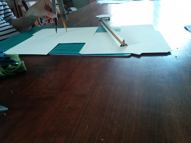
My wife is putting together a simple gift for our niece. Lest I spoil a surprise, I’ll be vague about the specifics. It required some hexagons. We started, logically, with an octagon.
I approached this mathematically. Find the midpoint on one edge, work an equal distance out either side, then connect the dots. Bam.
So, I moved to a circle that represented the diameter of the octagon pieces. Well, a circle was hard because I didn’t have a protractor to get the angles right. So, I moved to a rectangle with some right triangles taken out.
Well, with no protractor, it’s hard to draw a 120 degree angle. I could do a mean 45 with the quilting square, though.
Admitting defeat, I jumped to the Google and found a number of posts by searching, “draw regular hexagon.” The image searches were promising: one linked to a post from New Mexico State University which described how to draw a regular hexagon using a circle and a compass.
I went out to the garage and found a compass my grandfather probably had since before I was born that I snagged while cleaning out mom and dad’s garage last year. It sat contentedly in our garage until called upon, after which it performed wonderfully.
This provided me a quick reminder on the mental dissonance between thinking I know how something should work and being able to describe how it actually works. The best thing is that the number of points on the circle is infinite, as long as the radius is known. The more points I draw, the closer I get to another circle. This blew my mind in Flatland, (apparently, there’s now a movie?) and it blew my mind again when I did Saturday afternoon.
We’re on our way to one sweet gift (all planned and executed by my talented wife).


Very nice article, I’ve really enjoyed reading it. Dear, is it possible to set validation rules in Google forms for short text question type by mathematical logical equation e.g. Input should satisfy input % 2 ==0
No, you can’t use logic operations in form validation. The closest would be to use a regular expression (which you can do) to check for a valid input. If you want logic expressions, you’d have to either validate on the sheet and conditional format or host a web app form that saves data to a Google Sheet. Martin Hawksey has a blog post on a simple implementation.
Thanks sir for your prompt reply, I do agree with you that validation using regular expressions (regex) provide great way to do several rules that would be otherwise nearly impossible using the other available predefined rules. Despite that the given example above (input % 2 == 0) can be easily validated using regex, someone may sometimes need to validate using some logic by formulas similar to what can be done easily in Google sheets. Also using Google apps scripts (GAS) wouldn’t help as validation script methods provided by Google for forms makes also impossible to deviate from the above preset rules. I really appreciate your help for providing your suggested post, and if available please provide other basic sources of information for work-around tricks.
Hello Can you help me out for the below case?
I am working on one google sheet, where I have applied data validation on date (i.e. user (i.e. to whom I have shared the file) can enter / select only today’s / current date for data entry.)
Now the case is, sometime due to some reason, user was not able to do entry on same day, so I (i.e. Owner / admin of file) can violate that data validation criteria and can enter / select previous date.
I want app script for same.
When you set the validation, there are options in the object to either reject the change or to show a warning. In the script linked, change line 8 of
to:Setting
to true allows an invalid input, false disallows the input. As far as I know, there is no way to allow a single user to follow one rule and another use follow others. You could achieve the same without using data validation by checking the onEdit object trigger and seeing who made the change before accepting/rejecting the edit.how to fetch data validation in different spreadsheet