Posts
We’re playing with magnets this week in class. (We’re actually finishing playing with magnets now.) It’s been great and this is by far one of my favorite units to teach because everything is so hands on. We’ve done lab activities every day. Magnets are accessible. They’re approachable by students. They’re easy to put your hands on and learn from.
Play in science is crucial to the learning process. Mess with something, see what it does. Mess around again.
Today, some students were really playing with ideas and others were just playing.
There must be a balance. Finding that balance in allowing for play alongside play is hard to strike because they can switch so quickly. Intentional situations (good design) help maintain the balance. Finding ways to make students think they’re just playing around is a good way to have them really play with ideas.
It’s frustrating when that opportunity is missed.
Months ago, I turned off Jetpack on my blog. I use WordPress and Jetpack is a package of apps which handled email subscriptions, comment management, social media posting, etc. Unfortunately, it also collects a ton of information about visitors to the site for their own use.
I’m not in the business of passing your information along to another company. So, I turned off Jetpack. And off it stays.
As a result, I lost some things, one being email subscriptions. I just activated a new plugin which will handle subscribing to posts via email if that suits your fancy. Fill out the form at the bottom of the page with your name and email to opt in. Make sure you confirm your email address in the confirmation email you get!
As a matter of policy, I don’t collect any information about you without you knowing.
Email opt in is voluntary. Your email address stays private. Always.
If you would like posts mailed physically, send me a tweet, @bennettscience or leave a comment below and I’ll get in touch with you. Completely serious offer.
My wife had been hinting that she wanted to use recipe cards in the kitchen rather than her phone all the time. So, I took a few hours and made some up using Inkscape. They’re clean and minimal and print out as 4×6 cards on cardstock.


The font is a Futura clone, so no need to worry about royalties or licenses.
You can download the Inkscape files if you want to tweak the design (front, back). Or here’s a ready-made PDF for your printing pleasure.

I’m overwhelmed by the feeling of immense blessing and immense wretchedness each year. The birth of Christ – King of Heaven, seated at the right hand of God Himself – born in a barn…the lowest of lows. Entering our world to serve as the perfect sacrifice for our sins, a plan set in motion from the moment the fruit touched the lips of man, as a baby, completely dependent on those he came to save.
Parallel to his birth, Christ dying on the cross as a criminal. Crucifixion was saved for offenders who needed to be examples. Cruel and torturous, saved for the worst of the worst. Broken and returned to the lowest of lows.
From Ann Voskamps’ book, The Greatest Christmas:
… and on a chilled night under stars, there is no grand mass of people whose efforts pry the stars into place.
In an obscure caved barn, down some backstreet of Bethlehem, there is no great host whose good works unlatch heaven & impress God into coming.
Tonight, at the foot of the cradle of Christ, like at the foot of the Cross of Christ, there are no big people—no powerful, no proud.
Tonight there are only those who tramp to the manger with nothing; there are only the manger tramps, the men who lay down all the self-made, the women who lay down all the self-sufficiency, the children who lay down all the wants. We, the manger tramps, who kneel where thrones tremble and demons fall and the self-made crumble and the self-righteous weep.
Tonight there are only the manger tramps, who tramp in with all our poverty of spirit . . . so there can be an abundance of God.
And the bulk of all your worn shreds slip off the weariness of your back.
You have tried to polish enough for Him with these rags.
You have tried to patch together so much for Him.
You have tried to produce too much for Him with these rags.
And you—we—who are the manger tramps see it tonight, what He’s written in red on all our filthy rags: “But I did it for love.”
All of conquered heaven and grateful earth echo and throb tonight with the heart cry of the God-Child: “I did it for love.”
What can all the manger tramps do but wrap the vulnerable God in strips of our bare, broken hearts so He can lodge in the intimacy of us?
The greatest Gift laid into our empty hands…Grace is weightless.
Even the winning stars singing it over the manger tramps tonight.
God came because he chose us.
Merry Christmas.
I promised Stacy Lovdahl I’d post this the other day and then promptly forgot. Sorry, Stacy.
I took a graduate course on curriculum development and implementation this semester through Ball State. Not many of the assignments were open-ended enough to make for interesting blog fodder, so I didn’t post much. For my final project, I chose to redesign the course of study for my school based on an inquiry model. There are two components: the redesign document and the theory backing it up. They’re both available as Google docs with comments opened.
Many, many thanks to Michelle Baldwin and Kelly Tenkely from Anastasis Academy for late-night questions about inquiry mapping, standards reporting, and pretty much anything I couldn’t wrap my head around. Check out the work they’re doing…it’s amazing.
The end of the semester is bittersweet. It’s exciting to think of the long break coming up. At the same time, the burden of work to be completed feels futile for many. I’ve been fighting significantly lower effort patterns and I don’t really have a good way to bridge the gap. Part of the issue this year is that I missed an entire week to stay home with the new baby.
Not that I regret that time at all. By any means.
The theme for this week seems to be, “Why should I try? I can’t do anything about my grade now.” In some cases, this is true, and it’s a result of systematic, deliberate choices to not engage at any point along the way.
But.
I’m still responsible for helping my students learn. I’m constantly reminding myself that I cannot do the learning for them. There has to be an inkling of effort to engage with the tasks.
“No, we can’t take a day off.”
“Yes, we do have things to do today.”
“Yes, this will be on the test.”
(that last one kills me.)
I need to take each class as they come and make the most of it.
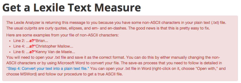
In October, I wrote about a bookmark application to get the text of a website for analysis in the Lexile analyzer tool. It’s a pain in the keister to copy text from a website, open a document, paste the text, save as a plain text file, then reupload to the Lexile website. The bookmark tool does the hard part for you (the clicks…all the clicks…) so you just download the formatted file and upload it to the Lexile site.
Depending on what you try and analyze, you might get an angry message like this one:
Nerdspeak, engage!
The only reason you’d use ASCII is if you, A) want to support legacy browsers (Netscape Navigator 1.0 anyone?) or, B) need to speed up query time on a string or a database. Modern web browsers are so much more efficient now, most sites use something called UTF-8. I’m guessing ASCII is needed for the Lexile analyzer so it can give you the score faster than it could with modern encodings.
Anyways, I pushed a fix to the applet tonight. It works by taking the text you highlight and encodes it to ASCII before downloading. So, still no conversions. And no angry red messages. And no more worrying about encodings.
You can grab the extension here or take a look at the source for yourself and tinker around.
I wanted to write this down while it’s fresh in my mind (and because it’s late).
I’m finishing a graduate semester on curriculum theory and practice and the final project I chose to complete was a redesign of a school’s curriculum. I decided to really push the boundaries and go for an all-inquiry, mixed age thematic classes. It’s a real swing from the norm. But, I think it can be done (mainly because it is being done).
Michelle Baldwin was kind enough to endure a ton of questions as I worked through some of the stickier points. Mainly, how does one lesson plan and account for mandatory standards in a school where students direct the exploration and topics for learning.
@bennettscience exactly. We still report on standards, but it's my job to look at what the kids are doing and figure that part out.
—Michelle Baldwin (@michellek107) December 6, 2015
What happens is linked back to the standard. Themes exist, but specific demonstrations come organically through exploration and play. The teacher’s job is to find those demonstrations and reconcile it with the student. Preempting the demo via planned assessment activity undermines inquiry.
My wife had our second daughter last week. I’ve been fortunate to be able to stay home with them this week and help out with the newborn and our two year old.

In the in-between times, usually late at night, I’d think about school stuff. In no particular order:
<braindump></braindump>
- I don’t do a good job recognizing culture in my classroom.
- I also don’t do a good job of having performance evaluations for students. Work is limited to the scope I set.
- At the same time, I don’t have a good way to have students access outside content. Many have devices, but many don’t.
- We’re moving into chemistry soon and finding those connections are difficult.
- I don’t want to give multiple choice tests anymore, but I have to stick with the other teachers in the department with the same course. So, how do I evaluate differently but maintain parity?
- When issues with ed tech are brought up, people take it really, really personally (I’m included there).
- Sometimes those personal feelings get in the way of good decisions (yep. Still including myself).
``
I’ve taken a big dive into test analysis lately. Spreadsheets, formulas, correlations, and color-coding have become the norm after an exam to help and identify misconceptions with my students as a whole and on a class-by-class basis.
One of the sheets I created (based on work done by Andy Schwen a few years back) color codes student responses in red if they got the question wrong, like this:

I started wondering if there were significant patterns between classes looking at the scored matrix rather than statistical figures. I grabbed screenshots of each class, dropped the opacity of the image to ~35% and then layered them all to make this:

What made this doubly-interesting is that the darker red areas on the page do not always line up with the statistical figures. For instance, I needed to revisit 2, 4, 9, 11, and 12 based on the statistical analysis (biserial value, if you’re curious). They had discrepancies between students who got it right and did well on the test when compared to those who got it right and did poorly.
Looking at the picture, I also went back and revisited 8, 9, and 17 just because a lot of people missed them. I also looked at number 5 because very few people got it wrong.
Teaching is science and art. Even if the art is doing test analysis.
The language I use around grading is very specific, especially when I’m speaking with students.
“Your grade is based on how much you learn. You must show me that you’ve learned.”
I also have a go-to response when students ask if a particular paper will be graded:
“The paper itself isn’t important. However, the work you do on the paper can demonstrate learning, which is how you’re graded. Second, and more importantly, mistakes you make on paper help me help you.”
Students usually agree with this sentiment. Until grades come around.
“I did all the papers! Why is my grade so low?”
“You haven’t demonstrated learning yet. What would you like to show me?”
“…but I did all the papers.”
The language is the same, but we’re speaking past one another. Until we can make clear the distinction between the process of learning and the demonstration (which can certainly happen in the process), we’ll continue to fight culture.
We’re working on our close-reading skills. Indiana has changed the standardized test format (again) and students will be doing very Common Core-like reading and analysis tasks as part of the new format. (Sidebar: it’s amazing that critical thinking and analysis are terrible under Common Core, but totally okay and great when Indiana copies them.)
This means I need to take time in class to actually teach some serious reading strategies. I’d done similar things implicitly in the past, but it’s now more important than ever to make students are equipped to be successful on the exams coming in the spring.
This activity is the first time students have gone through the process, so it’s taking serious time. The school improvement team has built and tested a model that we’re to use in class with our students so each class gives an equivalent experience.
Today, I grabbed an article from the textbook on Robert Goddard. We’ve just finished Newton’s laws of motion and talking about spaceflight and the apparent paradox of the third law is a good way to round out the chapter. The text is on grade-level, so students should be able to approach it on relatively sure footing.
To start, I read the article out loud while they underlined anything of interest. Our students have struggled with writing coherent responses to prompts because they lacked a basis for their response. Finding points of interest can help build a frame of mind to respond to a question later. Listening to me read modeled the pace they should use when they’re reading alone. We talked about phrasing and hearing their own voice in their heads. Most seemed to see the importance of this because they actually had time to process what they were reading as it was being read. We also discussed points of interest to help those who struggled find a good starting point.
I also found at this point it was important to acknowledge that the interesting point did not (and really shouldn’t) be a direct quote. It can be an idea or a theme. It can be a frame of reference – putting themselves into the shoes of the subject. It helped some who didn’t find anything in particular at the surface interesting to find a point they could dig into later.
Second, they re-read the article silently (modeling appropriate pace) while circling words that they didn’t know or found confusing. I described this as, “figuring out what you don’t know so you can go learn it.” Not knowing something is too distracting. I wanted to embrace the fact that they wouldn’t know some of the terms and that it’s okay.
After finding their words, they grouped up and compared. Words in common were circled and left. Words that were unique (one person, maybe) were peer-taught.
Finally, we regrouped and started going around the room defining terms in common. Before class, I had gone through and identified potential terms, but there were a lot thrown out that I hadn’t anticipated. Doing this as a class promoted idea sharing and helped students to see that they were not alone in confusion.
I don’t know what day of class this is, but here’s what we did today.
We took a test a week ago that did not go well, to say the least. I already wrote about that process. We took this week to slowly go back over ideas and rehash them…not from scratch, but pretty thoroughly. I’ve been trying to be more explicit in the methods of interaction – reading, writing, kinesthetic (lab), drawing, etc. Today was the final day of Newton’s Laws (#thesecondone) and I decided to have them create posters and/or short comics on one of the laws.
These are some of my favorite student pieces:


Yes, this is a brash Sir Isaac Newton breaking a tree with the apple.

Are they perfect representations? No. And there are others that show inconsistency. But, they were talking about the ideas and creating their own models based on understanding. Drawing (sometimes silly) pictures helps to internalize the idea and it opens doors for discussion. It allowed me to enter a conversation about physics at their level and do some intense teaching one on one, which was the goal.
I also challenged myself to creating some stories. I’m a major fan of xkcd, you’ll notice the resemblance because that’s my level of artistic ability:


It was a fun, light day with lots of growth. Tomorrow, we’ll quiz one more time before moving on to work and energy next week.
I gave a test a week or so ago. When I scored the test the first time, I didn’t think I made my key correctly. So, I double checked it and re-scored. Same result.
I immediately implicated myself in the low scores. My test may have been too hard. Perhaps I included things that weren’t taught. I went back and went over the entire test, item by item, and matched each to a set of notes, a lab, and the state standard I marked on my plans.
I taught everything on the test in at least three different modes. I did my job.
So, I turned to statistics to help me out. I ran item analysis on each question, both using Biserial values and Chronbach’s alpha test. It got nerdy fast.
With the exception of a few questions with low Biserial values (which I’d already identified as problematic, this just confirms) the test is reliable. All of the questions were within the accepted range of variance.
This confirms that the test was, in fact, valid and provided reliable results.
I can’t force students to engage. I can provide opportunities to engage and I can prod them that way, but at 15-18 years old, they need to make their own decision. Some classes have made that decision.
Two classes in particular are beginning to thrive. Two don’t know what they want, and two are continuing to really, really frustrating years.
I think it all comes down to the fact that students need to realize that everything they do as an individual affects every other person. That’s what a community is. We’re all affected, including me.
How do you teach that?
Our school is moving to more active use of Lexile scores for reading selections. The Lexile website has a nice analytic tool which allows you to upload text (after you create a user account) for analysis. The pain in this process is that A) you can only do it from the Lexile.com website, and B) it has to be plaintext.
So much of the web is rich text now that it’s difficult to create plain text files. It’s even difficult to do so using Notepad or TextEdit on PC and Mac because they want to save as rich text. Most teachers don’t realize that there is a particular process that must be used.
To lower the bar for entry, I wrote a small JavaScript bookmarklet to grab highlighted text from a webpage and download it as a properly formatted plain text file to then re-upload to Lexile.com’s analyzer.

Head over to the dedicated page to install (or play with) the app.
Fair warning – this may never be updated again. Use it til it breaks. (And share it with your friends.)
Spam on Twitter feels like an all-time high right now. Twitter itself is woefully horrible at taking reports of abuse and spamming and all a user can do is use the completely un-fulfilling “Report Tweet” option to block the user. When they spam hashtags, companies create robots faster than you can report.
Twitter spam is out of control.
MMSG.net (I’m not linking because I don’t want to give them any web traffic) has been spamming the #flipclass hashtag for months on end. The problem is that they do it through bots with randomly-generated, vaguely eastern-European-named “users.” The feed is filled with junk and blocking individual users doesn’t make much sense because they just make more users.
Twitter spam is out of control.
I use Martin Hawksey’s fantastic Twitter Archiving Google Sheet (TAGS) script to grab tweets for conferences, archiving, and just playing around with data visualization. It’s now my own personal robot for fighting other spam robots.
This one doesn’t spam, though. It reports the spam.
Twitter spam is out of control, so I build a robot.
The TAGS library is incredibly powerful…it relies on the TwtrService library created by Google which allows you to interact with the Twitter REST API, which means if you can get a user’s information, you can then send it back through a Google Script to report the tweet.
I watched these MMSG.net bots and realized the all have the company website in their profile. My robot now has a weapon.
My robot will fight your robot.
With some help from Martin, I added a line to the core TAGS code library which grabs the user’s profile URL and puts in into the archive.

Then, I wrote a second script which scans through the archive looking for the URL.
Then, I used triggers to run the script every hour. It clears the archive, grabs whatever tweets were sent during that time, and then reports those that match the key. All day. Every day.
My robot will fight your robot.
Featured flickr photo shared by kurichan+ under a Creative Commons ( BY-NC-ND ) license
This is the hardest part of teaching, if you ask me. What are the natural consequences of not completing a task in the given amount of time?
It started with a tweet from Alice Keeler:
STOP THE MYTH! Not one shred of research supports homework teaching responsibility. It is not true. Stop saying that.
—Alice Keeler (@alicekeeler) October 11, 2015
…and it really snowballed.
Homework – and whether or not to assign it – is extremely personal. It’s a methodological decision that (often) is tied very closely to the culture of learning a teacher tries to set up in their room.
Homework is divisive.
I teach high school…mostly 10th and 11th grade. Part of my responsibility to to teach responsibility to my students. Everything I do in my class rolls back around to life skills (this is called organic curriculum in the literature. See Glatthorn (1999) for more) and preparing them for their obligations once they leave the building.
I’m not naive. I know students are dealing with much, much more than I ever have. I have multiple students with children. Many with jobs. Most with clubs, athletics, and other extracurricular work. I also have some homeless, transient, and students dealing with significant adversity.
And it is my responsibility to make sure they’re learning.
We use class time to make sure that happens. I give plenty of time to work through content. I’m here to help. They work in groups. They can ask questions, make mistakes, reflect, and revise in a safe place.
But sometimes, students make decisions to not use the class time. That’s when it becomes homework.
Justin Aion wrote a great post which summarizes many of my thoughts on teaching responsibility. In particular,
At some point, the role of a teacher, in my opinion, slowly shifts to support, gradually handing off the responsibility for education to the student, helping them to become more and more independent before we release them into the world.
I struggle regularly with finding that balance. This year, with juniors and seniors, I am much more inclined to leave the responsibility up to them. I make myself available and do my best to support them, but the responsibility for learning and decision making is on them.
Is it irresponsible of me to ask that work not finished in the time given during the day be finished outside of class? For high schoolers, I don’t think so. Mainly because I know what support they’ve had during the day(s) of work on the task and really, anything leftover, should be minimal.
Here’s the problem: none of these conversations about homework consider the support already given.
It’s dogmatic. A kneejerk. And it’s hurting education discussions.
If I don’t finish work, I have to find time to do it. Period.
Why is it different for our students?
I’m here after school. I’m here before school. We have an advisory period. I can implore, beg, and even assign, but there is still a conscious decision made by a student to either take advantage of those opportunities or not. If they don’t, the only reasonable expectation that I have is that they do it at home.
Blaming the teacher for a student’s indiscretion is like blaming the principal for not getting your grades done on time. There is a set time period and it needs to get done.
Does homework – in and of itself – teach responsibility? No. Of course not. Neither does bringing a pencil to class. All I ask is that we start to look beyond the action and include the support system in place. What else is done? What could be improved? What might need to be dropped?
I left that discussion feeling angry and frustrated because we stuck to the idea that “all homework is bad.” To someone new to Twitter – and even someone old on Twitter – it comes across as a personal attack. I think Glenn Arnold said it best afterward:
@bennettscience no, old me would have too. But then I realize I'm not accountable to them, but to my Ss. And I still want to engage…
—GS Arnold (@arnoldscience) October 11, 2015
I (usually) enjoy the discussion…this time, I’m enjoying the reflection (again, Justin’s post is great). We need to think big picture. Forget homework – it’s a single thing that can influence learning. Let’s talk about the larger systems or cultures we’re building…that’s a discussion I can get into.
This post outlines a recent lesson and activity I designed for my integrated chemistry/physics students. Fair warning: science ahead.
The Problem
I teach a class called Integrated Chemistry & Physics. It’s meant to serve as an all-around physical science for high school students (they need one life science and one physical to earn a diploma). Being such, it’s a light touch in a variety of topics in both physics and chemistry. It also provides a lot of opportunities for students to experience the ideas, particularly in physics.
I’ve run into an issue where lab activities designed for physics students often bog my group down in procedure and over-the-top data collection, which muddies the purpose of the lab. I wanted to simplify our usual acceleration lab to make it a little more accessible from a less science-oriented perspective.
The Plan
Simplification was the goal. The difficult thing about acceleration is that you need to measure distance and time accurately. Doing this without equipment becomes a challenge in teamwork, which was an added bonus for this activity. Rather than having one student use a timer, I decided to go with a metronome so everyone in the class could hear the correct interval. Students released a marble from the top of a slanted white board and traced the path of the marble as it rolled through an interval from the metronome.
I hadn’t taught anything about acceleration yet, so I had the students hypothesize based on the following statement:
The distance a marble rolls will double if the time is doubled.
It provided an interesting discussion point as students argued over whether the marble rolled at a constant speed. Many didn’t consider the fact that doubled meant every interval (0.25s to 0.5s is doubling the interval) or just a single block of time.

The whiteboards had a nice record of the length of each trial. I know precision is just about out the window, but the generalities were helpful in building an understanding of what acceleration is. As they were taking data, there were exclamations of, “I can’t keep up! It moves too fast!” Having the kinesthetic experience through manual tracking is something that is lost when tech is used to get more precision.
The Results
Because this was done manually, the data were all over the place. Depending on how well the group worked, some had negative accelerations at the top of the board and very, very high accelerations at the bottom. I’m a fan of error in data because it reinforces the fact that being careful in the lab is very important. I had each group report their average distance rolled for each interval and I was able to graph the class data as position vs time and speed vs time to highlight the difference in shape for acceleration between the two.


Further Discussion
The nice thing about this lab is that it had components of very close teamwork, kinesthetic experiences, an achievable task, and great error for analysis. While we were discussing group results, students were noticing that their results varied widely between each group. So, I took the class data and animated how the graph changed as more and more data are added to the set.
Students immediately saw that the graph approached the correct shape as more data were added. I’m hoping this starts to end the question, “How many trials do we need?” in future experiments.
Next time I run this experiment, I’ll probably use ticker tape cars to remove the variability in data. I liked that they had to physically move the pen faster as the marble accelerated, but it caused a lot of issues in data analysis the next day and may have even introduced some misconceptions about acceleration.
What suggestions would you have? What changes could keep some of the kinesthetic experiences and simplicity in structure but improve on the task as a whole?
The Problem
If you’ve ever been in a situation where substitute teachers can log onto the computer but not do much with the Internet other than take attendance, it can make sub plans hard to pull together, especially if you want students to see a video. This is doubly true if you’re not in 1:1 environment where students can just pull it up on their own.
Over the last couple years, I’ve added an “absent” section to my class website to hold instructions for the sub. I’d make a video, put it on YouTube, and then put it on the site for the sub to play for the class. Once it’s set up, I just update the video and the instructions.
This requires two things: an Internet connection which allows for YouTube and one that allows external sites to be displayed. Neither can be done currently.
The Fix
I got around access issues by simply creating a local copy of the website and putting it on a flash drive. Modern web browsers can have video embedded directly in the HTML using the video tag, which makes the process much simpler.
But what if you don’t know how to write HTML or CSS, like this method requires?
I’ve created a template to do it for you.

Using the Templatizer
It’s a pretty simple tool for you to use. The challenge with these things is always to reduce the number of steps and clicks for general users. The point is to give you a fully-functioning website without knowing any code.
To use the templatizer:
- enter your class name, which becomes the title of the generated page.
- This step is very important – enter the filename of the video exactly as you have it on your hard or flash drive. The code needs media to reference, so if you put the wrong file, it won’t work. This only works with mp4 files for the moment. Also, try to avoid spaces in the filename because they can cause some wonkiness.
- Include any written directions you’d like shown below the video. If you don’t put anything here, nothing shows. This is unformatted text – bullets and other items won’t show up, so keep it simple.
When you’re finished, click on “Create and Download Page” button to download your shiny new website.
Once you have the file, you need to move it to the folder with the video. They must be in the same folder to work correctly. For me, I put these files in a folder call absent on the flash drive to make things easier on the sub.
The Result
Now, once the downloaded file and video are in the same place, open it up to test your page. You’re looking for two things – that the video plays and that the file is really being called from the filesystem, not the Internet.
Your browser address bar should have something similar to this if it’s from the flash drive:

It’s not perfect and limited to MP4 video right now, but it works. It solves a problem for me and I hope it can do the same for you.
I think I finally figured it out.
Getting charts and graphs created in Google Sheets (or Excel for that matter) has always been somewhat of a wrestling match between what I want the software to do and what the software thinks I want it to do. Predictive and suggestion-based user interface is nice, but not when I want to plot some data. Let me dictate what happens.
Excel isn’t as bad – you can create a chart and then manually set the Y and X axis series. No such workflow in Google Sheets.
The Task
This week, my students were collecting data for position and speed of an object as it accelerated down an incline. We put the data on the board and then I went to make a chart of it the following day. As usual, I selected the two columns to plot and inserted the scatter plot.
Here’s a sample table:

No matter how I selected the data – left to right, right to left – Google always put the velocity data on the X axis and time on the Y (in Excel, it remembers which direction you select data, so it’s an easy fix).
The Fix
I realized, after several minutes of trial and error, that Google defaults the X axis to data in the leftmost column. Seriously. It was that small of a distinction. So, you have two options: 1) Swap the columns, or 2) Select data manually. Because this sheet was dependent on some formulas I’d already written, I chose to do the latter.
In your spreadsheet, click on Insert > Chart or click on the chart icon.
In any tab, click on the data select tool to close the chart dialog and choose your data.
Select the range you would like to be on the X axis. Then, click on Add another range and select the Y axis range of data.

If all goes well, your new chart should have data on the correct axis in the graph.

I am having a similar trouble. My data sheet is supposed to be set up for the y axis to reflect the dependant variable. For some reason, google sheets is not recognizing this and is choosing its own data set up from 0-500, which makes no sense because its supposed to go from 0-100%. Also, when I change the min and max values from 0-100, the graph does not reflect the true data set. For example, for the x axis if its 100 people, the corresponding y axis should show 75%, but it has the bar up to 100%. I don’t know how to fix this and am sure it is user error. Please help
Bummer. Without seeing your sheet, it’s hard to say what exactly is happening. I would suggest making sure you’re selecting the top-left corner of the range (as opposed to the top right, bottom, etc). You can also try swapping the rows and columns using the checkbox option in the chart settings sidebar.